The Psychology of the Scroll: How to Design Ads That Stop Thumbs
Your ad has 1.7 seconds to matter. After that, it’s thumb food.
The average Meta user scrolls through 300 feet of content daily. That’s a football field of posts, stories, and ads, and yours gets maybe two inches of real estate. Most ads don’t get ignored. They get filtered out before the conscious brain even registers they exist.
Here’s how to break through the blur.
1. Visual Hierarchy: Don’t Make Me Think
When people scroll, they’re not reading, they’re pattern-matching at 90 mph. If your ad needs decoding, you’ve already lost.
The fix:
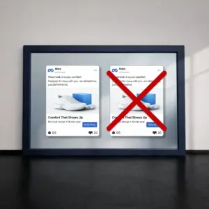
- One hero, not a committee: Multiple focal points = instant scroll. Pick one thing that matters.
- Faces beat products: Human faces (especially with direct eye contact) hijack attention faster than your product shot.
- Contrast or die: Low-contrast text on busy backgrounds is advertising suicide.
Reality check: Squint at your ad. Can’t tell what it’s about in under a second? Start over.
2. Color and Motion: The Attention Hijack
Bright colors are amateur hour. Strategic contrast is what actually stops scrolls.
What works:
- One power color: Not three, not five. One accent that pops against the feed.
- Motion in the first 3 frames: Even a subtle zoom or fade can outperform static.
- Break the grid: Asymmetry, unexpected crops, or “broken” layouts interrupt the scroll pattern.
Warm colors (red, orange) create urgency. Cool colors (blue, green) build trust. Pick your weapon based on your goal.
3. Copy That Closes, Not Explains
Your visual earns the pause. Your copy earns the click. But if they compete for attention, both lose.
The rules:
- Benefit in 5 words or less: “Finally, invoices that don’t suck” beats “Revolutionary invoice management software solution”
- Match the visual energy: Calm image? Calm copy. Urgent visual? Urgent words.
- Write like you text: Short bursts. Incomplete sentences. Natural rhythm.
Nobody reads ad copy. They scan for relevance. Give them a reason to care in the time it takes to blink.
4. Pattern Interrupts: Be the Purple Cow
When every ad looks like an ad, the weird one wins.
Disruption tactics:
- Raw beats polished: If everyone’s using studio shots, try iPhone footage
- Empty beats busy: White space in a cluttered feed is its own pattern interrupt
- Questions beat statements: “Still manually tracking leads?” beats “Track leads automatically”
The goal isn’t to be different. It’s to be impossible to ignore.
5. Emotional Triggers: Make Them Feel First
Logic doesn’t stop scrolls. Feelings do.
Triggers that work:
- Micro-stories over features: “Sarah closed 3 deals before lunch” beats “Increase productivity by 300%”
- Identity over utility: Speak to who they want to be, not what they need to buy
- Tension before relief: Create the itch before you offer the scratch
If your ad doesn’t trigger curiosity, envy, relief, or recognition in two seconds, it’s wallpaper.
The Thumb-Stopping Checklist
✓ Can you tell what this ad is about while squinting?
✓ Is there ONE clear focal point?
✓ Does the copy complement (not compete with) the visual?
✓ Would this stand out in a sea of similar ads?
✓ Does it make you feel something immediately?
TL;DR
Stop designing ads like billboards. Start designing them like thumb traps.
Every scroll is a micro-rejection of everything that looks like an ad. The winners don’t shout louder, they pattern-interrupt better. Clear hierarchy, strategic contrast, emotional hooks, and copy that connects in milliseconds.
Every swipe past your ad is a vote for literally anything else. Make your two seconds count.
Design accordingly.